The BReeze
The BReeze is a monthly newspaper covering Bridgewater Township and Raritan Borough, in central New Jersey. The BReeze wanted a logo that would balance a warm hometown feeling with a sense of polish and professionalism. The logo needed to function both in grayscale for the masthead and in color for online and print identity materials.

Sketches I presented several ideas to my client. Some were purely typographic designs. Some incorporated bridges and water, as the two municipalities are defined by the Raritan River. Others took the name literally with a windy style.

Polishing Ultimately, the client preferred the concept of a swooping, "breezy" R. I experimented with standard and custom typography, with the size of the B, and with the shape of the R.
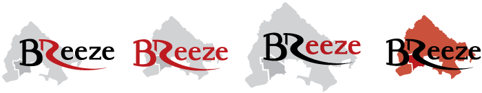
Color and Map Position After finalizing the wordmark, I set the typography over a silhouette of Bridgewater and Raritan, and experimented with placement and size of the map as well as color. I chose a color scheme utilizing the black, red, and silver of the towns' shared high school.
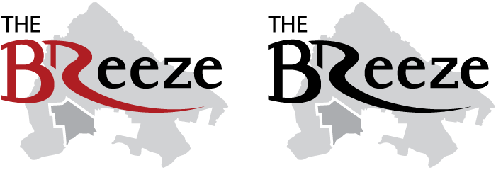
Final Logos The final logos included a thinner R tail shape to suggest breeziness, equal-height B and R shapes to reflect the partnership of the municipalities, and custom slab-serif letterforms. I kept the lettering in red and black and the map in light grays for maximum contrast, setting the BR in red to make it pop. The BReeze can be found in print, online at thebreezenj.com, and on Facebook at Facebook.com/TheBReezeNJ.