Queen B & King B
Queen B and King B are all-natural deodorants, which will be sold online. The client made very specific requests, including a font reminiscent of lipstick writing for the women's line, a stamp-style font for the men's line, and a stylized "B" or "Bee" to represent the beeswax in the product.
Logos I designed a chunky "B" with a honeycomb pattern in a rich gold to represent the beeswax. For the "Queen" font, I added ragged edges to a fluid handwriting font, and selected a very feminine, strong pink. I chose a gritty, masculine "King" font in a heavy black.
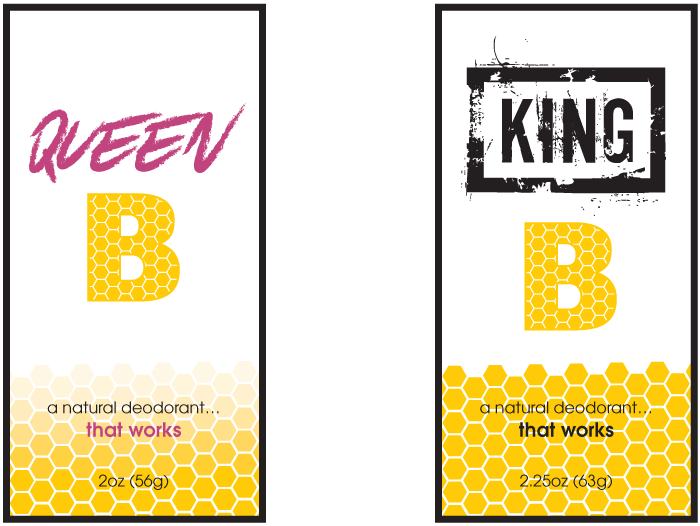
Labels: Front I continued the honeycomb pattern and color scheme onto the labels.
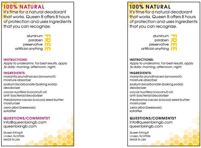
Labels: Back Again, I repeated the honeycomb pattern and color scheme.