Rube Goldberg Machines
I designed this five-page magazine article to reflect the whimsy of Rube Goldberg machines. I kept the type and layout blocky and modern to contrast with my red herky-jerky illustration.
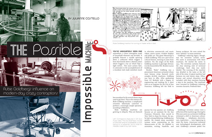
Pages 1-2 The duotone images of a real-world Rube Goldberg are paired with a jumble of compatible fonts. The body and caption type are highly legible. All the faces, however, have a machine-like character.
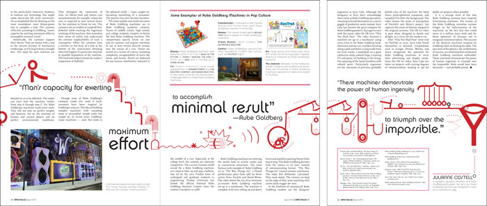
Pages 3-5 My Rube Goldberg spans all five pages and is made completely of type (typeface: Chalet). Pull quotes hug the machine.
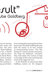
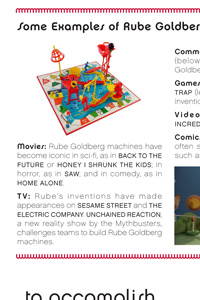
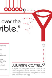
Details Other details of my design include a traditional folio, a sidebar with a border of 'M's, and the payoff of my machine: delivering an 'O' to my author bio.